Pages

Friday, 6 January 2012

Am I an Expert?

Where do I rate myself on the novice to expert scale?
Knowledge: I feel that my Knowledge of my area is competent. I have a good knowledge of the practise I have chosen as well as a small understanding of it's history. I also have a competent knowledge of the software I use such as Indesign and photoshop however I think that in softwares I need more experience and practise in order to refine my level of knowledge in these programmes.
Standard Of Work: In all aspects of work I like my standard to be high. I am a perfection and unhappy when things don't look exactly right even if it is just a rough sketch. However this sometimes leads me spend hours on one piece leaving another without enough time for it, for this reason I haven't rated myself an expert.
Autonomy: I am able to take responsible for my own actions and work and others when necessary. I am capable of doing my work and brief without any instruction however I do like to have feedback from tutors which is why I do not feel I'm an expert.
Coping With Complexity: I have rated myself as competent with complexity as sometimes I tend to panic. However I am a good planner and organising which helps me to cope with difficult briefs.
Perception Of Concept: I like to think that I am able to see the bigger picture and concept of my work and how it works in terms of longer goals, however I think that sometimes I think that I don't always think of the bigger picture when I have an idea that I love. Sometimes I forget to think bigger

My Eigth ITAP Lecture

My 5 key principles are:
  • A brief history of production
  • Essential Milestones
  • The Design Workflow
  • From Novice To Expert
  • The Experts
In this ITAP the idea behind this lecture was focused highly on the history of production and essential milestones that have effected us and how this affects us not only today but possibly into the future as well.

Why Do They Look This Way?

When a character is being designed, whether it is in a book, for a photo, drawing or film every aspect of how they look, talk and behave is a conscious decision by the designer. From the colour of their hair to the clothes they wear, the choices made all have an effect on the viewer. Whether this is conscious or subconscious.
Harry Potter
Appearance:When we first meet Harry Potter he is living in the cupboard under the stairs. Apart from that this his bedroom and obviously no place for a child, Harry's appearance tells us the same tale of neglect and lack of love. Harry is small in size for a boy of 11 and is pale in complexion, which makes you think that he is under fed. His hair is long and messy and the clothes he wears are over sized and worn. This suggests that these aren't Harry's clothes but hand me downs from Harry's cousin Dudley. This gives the impression that Harry has no clothes or belongings of his own and is uncared for by his aunt and uncle. From Harry's appearance we instantly feel sympathetic towards him.
Action and Interaction:
In the beginning of the film Harry lives with his aunt, uncle and cousin Dudley. Harry is bossed around by all he lives with and because of this Harry is not only small in size but small in character. He is quiet, understated and gives the aura of unhappiness and the audience is given the impression that this has been like forever because he does not argue or misbehave. Harry is obedient when being bossed around but the behaviour, quiet and sad facial expressions, around the other characters suggests that he wishes things would change. Again this creates a sympathy towards Harry as well as a dislike towards the aunt, uncle and cousin.
The overall effect of Harry's appearance and behaviour tells the audience that this boy is unwanted and uncared for by those he lives with. He is bullied by his cousin and bossed around by his aunt and uncle. He gives the audience the impression that he wishes things were different but knows that nothing is going to change. The audience feels sadend for this boy who is sad, lonely and unloved.

The Design Process

When it comes to the creation of a piece of work whether it be self iniated or commercial all practitioners will have a process that they will go through in order to create it. Although it may very from practitioner, the initial structure of the design process will be very similar if not exactly the same.
Image Taken From:
http://www.helloari.com/wp-content/uploads/process-explained.jpg
Here is an example of how the design process may be drawn out as a diagram. In the beginning there are lots of lines as your brain thinks of many ideas and does a lot of research, then the lines would become less as some of the ideas are experimented with and prototypes are created. Eventually the lines will become one singular line as the idea is refined into the final experiments and then the final creation.

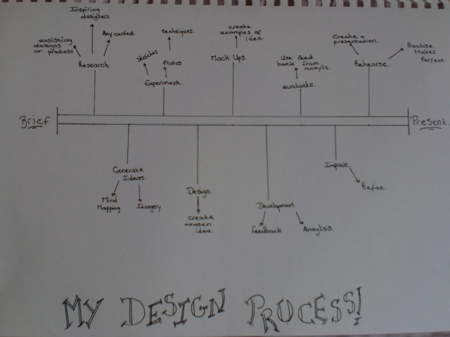
Although this a very simple version of the design process I think that this will be the basic structure the all designers will use, including myself. For my brief on creating a magazine I also followed a design process, here is the design process I followed.

Monday, 12 December 2011

What Are You Drawing?

Sometimes work produced takes more research than just looking into existing work and practitioners. Sometimes a piece of work will require further investigation into the topic of the work, for example if creating illustrations for a medical book research may be required into how the organs look, how they need to drawn or broken down for the book or a book on pregnancy may require research the stages, the baby, organs etc . Without this knowledge the illustration could be wrong and no good for the purpose.
One final piece for my domestic violence brief.
An information card on how to help to prevent domestic violence.
For one previous brief I created a campaign for domestic violence against women, using facts and figures of domestic violence to create awareness and prevention. For this work I had to do a lot of research into the figures about the amount of violence. There was a lot of available material, lots of existing figures and records for many different years, countries and world wide. It required a lot of research into the information available and because i did this I was able to correctly incorporate and create my campaign around them.

Swine Flu Virus, Edmond Alexander
From: http://www.cynthiaturner
Looking at an working practitioner, Edmond Alexander shows us that research is required to create informative diagrams and illustrations. Edmond Alexander shows us how medical illustrations can not only be informative but beautiful. Alexander is a medical illustrator that specialises in not only 2D but 3D visualisation of medical information. Alexander notes that his illustrations 'have been heavily influenced by the beauty of the Disney films during his childhood years, and the art of Frank Armitage during his formative years in medical illustration,'
http://www.alexanderandturner.com/html/edmond_alexander_biography.html.
Alexanders work is recognisable through the strong and vibrant colour and very graphical, digital look to the works. The swine flu virus work demonstrates that Alexander would have had to do research into not only the swine flu virus but it's transmission from pig to human, how the virus looks and that the virus causes the production of antibodies in order to create an accurate illustration.
This principle is also demonstrated by Alexander's partner Cynthia Turner who is also a medical illustrator. One of her works on Asthma would have required research on the condition itself, bacterias, cytokines, histamines and how these all look not only themselves but within the lungs.
Cythia Turner's Illustration On Asthma
From: http://www.alexanderandturner.com/assets/images/autogen/a_19a.jpg

Tuesday, 6 December 2011

Looking Legibility At Work

Road Sign
Taken From: www.proshieldsafetysigns.co.uk
I am now going to look at how different designers use the legibility of the type in their work.
In some cases it is important that the text is easily legible. The best example of this is road signs. Drivers need to be able to read signs quickly and easily, usually from a distance so that they will be able to make a decision in time. If the designer didn't make signs easily legible it could cause a serious accident.
NHS Advertisment for stopping smoking during
pregnecy. Taken From: www.thetelegraphandargus.co.uk/


However the designers doesn't always have to use text that is legible. Sometime the image used can be strong enough to convey the message and the text is used to strength this or to add extra information.
This advertisement for stopping smoking during pregnancy. Almost all the text is very small and would be difficult to read at a quick glance. However the image itself tell the viewer everything. If you smoke during pregnancy your baby smokes as well. The text is used to add information on how it harms yours child and how to get help.

David Carson is a graphic designer who uses text that is not always legible. I have chosen to look at him because he is known for his graphic designs for magazines, which is what I am doing for my current brief.
David Carson's legibility often relies upon the reader having good attention span, the reader has to want to read what was there on the page. Here is an example of David Carson's cover for Ray Gun magazine. Here he uses large amounts of texts, they are placed all over the page, in different sizes and font styles. The text is layered over an image, with another appearing to cut up the text. To the viewers eye line they are drawn to the magazine title, Ray Gun, the rest of the page tho appears chaotic and distracting, the reader has to be willing to spend the time reading this cover. This lack of legibility works for Carson because not only is this his intention but his audience is willing and want to spend the time reading what is on the page.


Can You Read This?

The consideration of the legibility of text is one of the key points to consider when creating a piece of work. The situation the work is going to used in could affect what choice is made for the text. For example, is the viewer going to need to be able to see the texts clearly and quickly, like a road sign or billboard where a viewer may only get a few seconds to read it as their car goes by. Or is the viewer going to have time to be able to read the texts over a period of time, such as magazines or newspaper article, advertisements or perhaps a piece of art.
What makes something legible is dictated by certain choices made by the designer. What affects the legibility of something is:
  • SIZE- It is obvious that larger texts are easier to read; small sizes are not always as easy and could cause the reader to become bored of trying to read the piece.
  • COLOUR- can affect the legibility. Dark colours on light backgrounds should be easy for the eyes to read, such as black on white however certain coloured type for example red and green cause confusion to the eye. Light font colours and a light background are usually straining on the eye to read, such as yellow on white.
  • ALIGNMENT- When the text is all aligned the same the eye will simply follow the sentence from line to the next. If the text is aligned differently, one line is aligned left and the next is centred and the next is aligned right, the eye might struggle to follow the lines of texts.
    • TYPEFACES- simple typefaces are easier to read; sometimes certain typefaces at smaller sizes are too difficult to read.
      • MEDIA- Where or how the work is going to be displayed could affect the legibility. Large media surfaces such as billboards could make the legibility easier. Small media platforms could make the type harder to read.
      • BACKGROUND- Plain backgrounds allow the eye to focus purely on the text, busy backgrounds or text over the top of images make the text harder to see and therefore harder to read.
      Designers consider all these points, if not more, when creating a piece of work. The designers choice can and will affect the legibility. Most work needs clear text in order to convey the message to the viewer however sometimes designers make the conscience decisions to make the legibility difficult to coincide with the message or visual look of the piece.