With a new year and prehaps a more focused path, hopefully towards advertising, I have decided to start a new blog. If you wish to keep folllowing moy journey I'll now be posting on http://eyecandygraphic.wordpress.com
I hope to see you there.
Monday, 10 September 2012
Tuesday, 20 March 2012
Politically Driven
Vince Goole's lecture on Adrain Piper and Jenny Holzer made me realise that a concept has to a very strong one. However I also noticed that both Piper and Holzer were affected by the politics at the time. This is an idea which is also true to visual communication and graphic design. Many designers can use their work to argue or raise awareness of a politcal issue.
This campaign below, which I found in Milton Glaser's book The Descent of Design, is a politically driven campaign to raise awareness of domestic violence. What stood out for me in this campaign was that the approach was a lot more subtle to a subject which is still considered a bit of a taboo. Instead of using an obvious approach, such as using photographs of beaten women, a campaign with the shock value. In this campaign the idea of using a lipstick print which is formed by images associated with domestic violence, glass, men beating women and fists, is a much more subtle and effective approach. It makes people look at it more carefully, working out what has created the lipstick print, and the viewer doesn't feel too uncomfortable about a dark subject.


This campaign below, which I found in Milton Glaser's book The Descent of Design, is a politically driven campaign to raise awareness of domestic violence. What stood out for me in this campaign was that the approach was a lot more subtle to a subject which is still considered a bit of a taboo. Instead of using an obvious approach, such as using photographs of beaten women, a campaign with the shock value. In this campaign the idea of using a lipstick print which is formed by images associated with domestic violence, glass, men beating women and fists, is a much more subtle and effective approach. It makes people look at it more carefully, working out what has created the lipstick print, and the viewer doesn't feel too uncomfortable about a dark subject.


Semester 2: Vince Goole
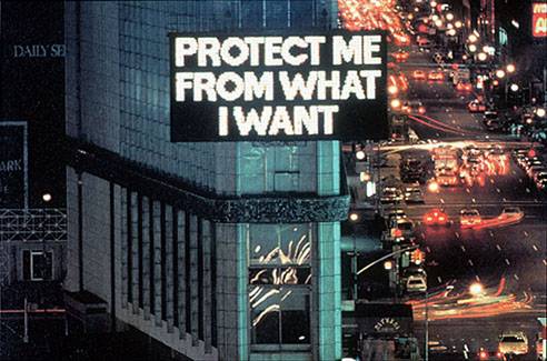
In this lecture we had a guest speaker, Vince Goole who spoke to us about 2 artists that had inspried his work, Andrian Piper and Jenny Holzer. Adrian Piper's early work centers around the idea that being different to the morm makes you invisible as people will go out of the way to ignore you. She explored and demonstrated this idea by going out and measuring peoples reactions to her doing unusual things.
 In this piece she rides the subway with a towel stuffed in her mouth and see's how the people around her pretend that she is not there. Adrain Piper is a fair skinned african american women, because of this people around her would say racist comments without realising that they are offending or upseting her. Piper's answer to this was producing a calling card which she would give or leave for the person in question.
 Adrian Piper's work has a very strong confrotational edge that may make people feel uncomfortable, especially when concerning her race. Piper's work looks to have been influenced by politcally which is also similar to Jenny Holzer's work. While Jenny Holzer's work has a less confrontational edge than Adrian Piper's it too confronts people and the world that surrounds her and us. Her statements of trueism are there to give the viewer a chance to think about what is true in the world that surrounds them.


Thursday, 15 March 2012
George Lois
While looking at the creative revolution and Bill Bernbach I came across George Lois who worked at Doyle Dane Bernbach during the creative revolution. I went on to explore this guy further. (There was alot.)
'Every industry has it's stars and in the world of advertising George Lois is a super nova, the orginal Mr Big. Since the 50's he's had a titanic influence on world culture.' Buissness Week.
George Lois was born in New York on June 26th 1931. He began his career in advertising after he returned from his stint in the war. CBS was where he began in the advertising and promotion department desiging print and media projects. In 1959 he was hired by Doyle Dane Bernbach, where he stayed for one year.
 Chemstrands leotards ad is one George Lois created while he was at Doyle Dane Bernbach. This advert by George Lois was the first peice of work I saw by him. It intruged me to look at him further because I just fell in love with the concept. It was created during his time at Doyle Dane Bernbach. I loved the the simplicity of the layout and the humour which makes the reader the laugh, this causes the advert to be memorable.
'Every industry has it's stars and in the world of advertising George Lois is a super nova, the orginal Mr Big. Since the 50's he's had a titanic influence on world culture.' Buissness Week.
George Lois was born in New York on June 26th 1931. He began his career in advertising after he returned from his stint in the war. CBS was where he began in the advertising and promotion department desiging print and media projects. In 1959 he was hired by Doyle Dane Bernbach, where he stayed for one year.

Pushing Through A Naughty Ad When The Boss Is Out Of Town
"Chemstrand Nylons was stuck with a huge inventory of leotards. A double page ad was needed to run the next day in Women’s Wear Daily. I got the idea, wrote the copy, had the photo taken, designed the spread and made the deadline. The ad ran and orders for leotards poured in- Chemstrand’s most successful trade ad ever. Only one snag: Bill Bernbach was out of town, and when he got back and saw my ad, though he loved my work, he hated the ad. (The great man had a lousy sense of humour) When I respectfully told my boss he was a prude, he blinked. And when he got a congratulatory call from the CEO of Chemstrand, he beamed. So here’s my advice gang. Get your risqué ads to the newspaper when your boss is out of town." George Lois
"Chemstrand Nylons was stuck with a huge inventory of leotards. A double page ad was needed to run the next day in Women’s Wear Daily. I got the idea, wrote the copy, had the photo taken, designed the spread and made the deadline. The ad ran and orders for leotards poured in- Chemstrand’s most successful trade ad ever. Only one snag: Bill Bernbach was out of town, and when he got back and saw my ad, though he loved my work, he hated the ad. (The great man had a lousy sense of humour) When I respectfully told my boss he was a prude, he blinked. And when he got a congratulatory call from the CEO of Chemstrand, he beamed. So here’s my advice gang. Get your risqué ads to the newspaper when your boss is out of town." George Lois
I loved this piece of advice from Lois, not that I think you'd get away with running an ad without the bosses premision these day but the principle that sometimes risque is a good thing.
Semester 2: The Creative Revolution
This lecture was about the creative revolution in advertising which took place in New York between 1954 and 1964. The leading man in this revolution between design and meaning was Bill Bernbach. Bernbach was an advertising executive, a founding member of Doyle Dane Bernbach and advertising creative legend during the height of his success. Born in 1911 in New York Bernbach graduate from New York university with a degree in literature and began to make his way into his career in advertising. Even now a legend back then Bernbach had trouble getting his foot in the door and actually began his career in the mail room writing ads for his employers. However Bernbach eventually persuaded an employer that he had some talent and was promoted to the advertising department. In 1949 Bernbach co founded Doyle Dane Bernbach and soon the creative revolution would begin.
Bernbach wanted to change what was going on at the time in most ad agency's by adding personality, humour and a creative touch to a campaign. The most memorable example of this revolution is VW Beetle 'Think Small' campaign. Radically different from ad's at the time which consisted of a squared up image, a headline line describing the picture, 3 columns of text below and a large logo, the VW ad although similar in layout was in fact very different. The image used was very small, black and white, and left a lot of white space. The strap line 'Think small' was very different to the gimmicky, or most of the time obvious description of other ads. Bernbach focused on what made the Beetle different from the other cars at the time and used this to promote the VW and almost ridicule the big American cars at the time which most people couldn't realistically afford. Through all of these decisions not only did Bernbach manage to sell a German car soon after the war but began the creative revolution in advertising which would change the world forever.


Looking at the creative revolution taught me that you should take risks with your work, just because no one else has done or is doing it doesn't mean that you can't. If everyone is doing the same thing it doesn't mean it's the right thing. You should have bravery to do things that you think are good even if it's not the norm at the time.
Tuesday, 13 March 2012
Simple But Different Still works.
The idea of simple but different is a principle which I have found so influential on my work. I always tended to make my ideas more complicated in the subconcious illusion that complexitiy means you have achieved a good piece of design however from this lecture I have realised that simple but different is a great piece of design and it is in fact to harder to execute something that is simple brilliantly. From discovering this I have and will try to strip my ideas down to the simplest idea, am I telling the viewer the obvious, is this funny, is this this like all the other adverts out there and most importantly is this memorable, if I saw the ad would I tell someone else about. By asking myself these question I think I am on the road to being able to execute a good maybe one day great idea.
Some examples of simple but different ideas I have found or seen are posted below.
Some examples of simple but different ideas I have found or seen are posted below.
- The Durex Dog Viral Ad
- The Compare The Market Ad
Semester 2: Simple But Different
"Simple is the ultimate sophistication." Leanardo Da Vinci
In a world where we are bombarded by endless information, signs, advertisements etc, it is very easy to feel like you are overloaded with information. Everyone is trying to find a way stand out for the rest which in this environment is very hard. The key to achieve this is simple, when everything is complex a simple design, or idea will stand out from the rest. However there is a difference between just a simple idea or design and a good or even great simple idea. A bad simple idea is boring, plain or has no impact or meaning on the viewer, the concept is weak and hasn't been executed well. A good simple idea is about subtracting the obvious and adding or keeping a meaning to it. If you subtract most elements from an advert to make it simple and remove the meaning in doing so this would make a simple idea bad. In conclusion achieving a great advertisement is an idea which is simple but different, a combination of engaging, meaningful, good craftsmanship and most of all memorable. Achieving great simplicity is rare, however it is not impossible there are advertisements both past and present that display this idea at its best.
- The VW Snow Plough Ad
The Snow Plough advert from 1964 is a perfect example of the principle simple but different, the advert was very different from the other car adverts of the time. What made this ad so different was it used simple wit which engaged with the viewer rather than telling the viewer the obvius, which is that the VW is so reliable it will always start in the winter. The fact the advert is funny and egaging makes it memorable.
- The Levi Laudrette Ad
The Levi Jeans advert set in the laudrette is also an example of the excution of simple but different achieved beautifully. I even knew this advet before it was shown in lecture and I wasn't around at the time, a sign of how memorable it is. What also makes this adverts so brilliant is the excution of simple storytelling which makes the viewer smile combined with popular, catchy and memorable music and the concious desion to use the vintage look which is and was very popular. One fact I learnt about this advert that love is that the advertisment standard would not allow the model to wear y fronts in the ad as they were to revealling but allowed him to wear boxer shorts instead. This advert had to be pulled as they ran out of jeans to sell, I think that fact says everything about the success of this advert.
- The Cadbury Gorrilla Ad
Many great adverts that use the principle simple but different have used a brand vechiles. These characters are engaging to the viewer and either funny, cute, interesting or usually a combination. Some big brand vechicles are that I have remembered are S.M.A.S.H robots, the honey monster, Tony the Frostie tiger, the PG tips monkey, Alexander Meerkat and I am sure there are many more. One of Cadbury most recent and memorable adverts using a brand vechile is Cadbury's use of a gorrilla. Playing the drums to Phil Colins the air tonight Cadbury's captures the idea that Dairy Milk makes you happy in a way that is simple but different, who would have thought to use a gorrilla to show this. When released in August 2007 more than 185,000 people had watched the Cadbury advert by December and broke all records for downloads, with more than 600 postings on YouTube, and the videos being viewed about 10m times online.
Subscribe to:
Comments (Atom)