With a new year and prehaps a more focused path, hopefully towards advertising, I have decided to start a new blog. If you wish to keep folllowing moy journey I'll now be posting on http://eyecandygraphic.wordpress.com
I hope to see you there.
Monday, 10 September 2012
Tuesday, 20 March 2012
Politically Driven
Vince Goole's lecture on Adrain Piper and Jenny Holzer made me realise that a concept has to a very strong one. However I also noticed that both Piper and Holzer were affected by the politics at the time. This is an idea which is also true to visual communication and graphic design. Many designers can use their work to argue or raise awareness of a politcal issue.
This campaign below, which I found in Milton Glaser's book The Descent of Design, is a politically driven campaign to raise awareness of domestic violence. What stood out for me in this campaign was that the approach was a lot more subtle to a subject which is still considered a bit of a taboo. Instead of using an obvious approach, such as using photographs of beaten women, a campaign with the shock value. In this campaign the idea of using a lipstick print which is formed by images associated with domestic violence, glass, men beating women and fists, is a much more subtle and effective approach. It makes people look at it more carefully, working out what has created the lipstick print, and the viewer doesn't feel too uncomfortable about a dark subject.


This campaign below, which I found in Milton Glaser's book The Descent of Design, is a politically driven campaign to raise awareness of domestic violence. What stood out for me in this campaign was that the approach was a lot more subtle to a subject which is still considered a bit of a taboo. Instead of using an obvious approach, such as using photographs of beaten women, a campaign with the shock value. In this campaign the idea of using a lipstick print which is formed by images associated with domestic violence, glass, men beating women and fists, is a much more subtle and effective approach. It makes people look at it more carefully, working out what has created the lipstick print, and the viewer doesn't feel too uncomfortable about a dark subject.


Semester 2: Vince Goole
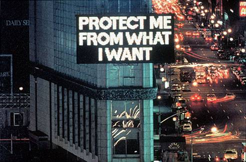
In this lecture we had a guest speaker, Vince Goole who spoke to us about 2 artists that had inspried his work, Andrian Piper and Jenny Holzer. Adrian Piper's early work centers around the idea that being different to the morm makes you invisible as people will go out of the way to ignore you. She explored and demonstrated this idea by going out and measuring peoples reactions to her doing unusual things.
 In this piece she rides the subway with a towel stuffed in her mouth and see's how the people around her pretend that she is not there. Adrain Piper is a fair skinned african american women, because of this people around her would say racist comments without realising that they are offending or upseting her. Piper's answer to this was producing a calling card which she would give or leave for the person in question.
 Adrian Piper's work has a very strong confrotational edge that may make people feel uncomfortable, especially when concerning her race. Piper's work looks to have been influenced by politcally which is also similar to Jenny Holzer's work. While Jenny Holzer's work has a less confrontational edge than Adrian Piper's it too confronts people and the world that surrounds her and us. Her statements of trueism are there to give the viewer a chance to think about what is true in the world that surrounds them.


Thursday, 15 March 2012
George Lois
While looking at the creative revolution and Bill Bernbach I came across George Lois who worked at Doyle Dane Bernbach during the creative revolution. I went on to explore this guy further. (There was alot.)
'Every industry has it's stars and in the world of advertising George Lois is a super nova, the orginal Mr Big. Since the 50's he's had a titanic influence on world culture.' Buissness Week.
George Lois was born in New York on June 26th 1931. He began his career in advertising after he returned from his stint in the war. CBS was where he began in the advertising and promotion department desiging print and media projects. In 1959 he was hired by Doyle Dane Bernbach, where he stayed for one year.
 Chemstrands leotards ad is one George Lois created while he was at Doyle Dane Bernbach. This advert by George Lois was the first peice of work I saw by him. It intruged me to look at him further because I just fell in love with the concept. It was created during his time at Doyle Dane Bernbach. I loved the the simplicity of the layout and the humour which makes the reader the laugh, this causes the advert to be memorable.
'Every industry has it's stars and in the world of advertising George Lois is a super nova, the orginal Mr Big. Since the 50's he's had a titanic influence on world culture.' Buissness Week.
George Lois was born in New York on June 26th 1931. He began his career in advertising after he returned from his stint in the war. CBS was where he began in the advertising and promotion department desiging print and media projects. In 1959 he was hired by Doyle Dane Bernbach, where he stayed for one year.

Pushing Through A Naughty Ad When The Boss Is Out Of Town
"Chemstrand Nylons was stuck with a huge inventory of leotards. A double page ad was needed to run the next day in Women’s Wear Daily. I got the idea, wrote the copy, had the photo taken, designed the spread and made the deadline. The ad ran and orders for leotards poured in- Chemstrand’s most successful trade ad ever. Only one snag: Bill Bernbach was out of town, and when he got back and saw my ad, though he loved my work, he hated the ad. (The great man had a lousy sense of humour) When I respectfully told my boss he was a prude, he blinked. And when he got a congratulatory call from the CEO of Chemstrand, he beamed. So here’s my advice gang. Get your risqué ads to the newspaper when your boss is out of town." George Lois
"Chemstrand Nylons was stuck with a huge inventory of leotards. A double page ad was needed to run the next day in Women’s Wear Daily. I got the idea, wrote the copy, had the photo taken, designed the spread and made the deadline. The ad ran and orders for leotards poured in- Chemstrand’s most successful trade ad ever. Only one snag: Bill Bernbach was out of town, and when he got back and saw my ad, though he loved my work, he hated the ad. (The great man had a lousy sense of humour) When I respectfully told my boss he was a prude, he blinked. And when he got a congratulatory call from the CEO of Chemstrand, he beamed. So here’s my advice gang. Get your risqué ads to the newspaper when your boss is out of town." George Lois
I loved this piece of advice from Lois, not that I think you'd get away with running an ad without the bosses premision these day but the principle that sometimes risque is a good thing.
Semester 2: The Creative Revolution
This lecture was about the creative revolution in advertising which took place in New York between 1954 and 1964. The leading man in this revolution between design and meaning was Bill Bernbach. Bernbach was an advertising executive, a founding member of Doyle Dane Bernbach and advertising creative legend during the height of his success. Born in 1911 in New York Bernbach graduate from New York university with a degree in literature and began to make his way into his career in advertising. Even now a legend back then Bernbach had trouble getting his foot in the door and actually began his career in the mail room writing ads for his employers. However Bernbach eventually persuaded an employer that he had some talent and was promoted to the advertising department. In 1949 Bernbach co founded Doyle Dane Bernbach and soon the creative revolution would begin.
Bernbach wanted to change what was going on at the time in most ad agency's by adding personality, humour and a creative touch to a campaign. The most memorable example of this revolution is VW Beetle 'Think Small' campaign. Radically different from ad's at the time which consisted of a squared up image, a headline line describing the picture, 3 columns of text below and a large logo, the VW ad although similar in layout was in fact very different. The image used was very small, black and white, and left a lot of white space. The strap line 'Think small' was very different to the gimmicky, or most of the time obvious description of other ads. Bernbach focused on what made the Beetle different from the other cars at the time and used this to promote the VW and almost ridicule the big American cars at the time which most people couldn't realistically afford. Through all of these decisions not only did Bernbach manage to sell a German car soon after the war but began the creative revolution in advertising which would change the world forever.


Looking at the creative revolution taught me that you should take risks with your work, just because no one else has done or is doing it doesn't mean that you can't. If everyone is doing the same thing it doesn't mean it's the right thing. You should have bravery to do things that you think are good even if it's not the norm at the time.
Tuesday, 13 March 2012
Simple But Different Still works.
The idea of simple but different is a principle which I have found so influential on my work. I always tended to make my ideas more complicated in the subconcious illusion that complexitiy means you have achieved a good piece of design however from this lecture I have realised that simple but different is a great piece of design and it is in fact to harder to execute something that is simple brilliantly. From discovering this I have and will try to strip my ideas down to the simplest idea, am I telling the viewer the obvious, is this funny, is this this like all the other adverts out there and most importantly is this memorable, if I saw the ad would I tell someone else about. By asking myself these question I think I am on the road to being able to execute a good maybe one day great idea.
Some examples of simple but different ideas I have found or seen are posted below.
Some examples of simple but different ideas I have found or seen are posted below.
- The Durex Dog Viral Ad
- The Compare The Market Ad
Semester 2: Simple But Different
"Simple is the ultimate sophistication." Leanardo Da Vinci
In a world where we are bombarded by endless information, signs, advertisements etc, it is very easy to feel like you are overloaded with information. Everyone is trying to find a way stand out for the rest which in this environment is very hard. The key to achieve this is simple, when everything is complex a simple design, or idea will stand out from the rest. However there is a difference between just a simple idea or design and a good or even great simple idea. A bad simple idea is boring, plain or has no impact or meaning on the viewer, the concept is weak and hasn't been executed well. A good simple idea is about subtracting the obvious and adding or keeping a meaning to it. If you subtract most elements from an advert to make it simple and remove the meaning in doing so this would make a simple idea bad. In conclusion achieving a great advertisement is an idea which is simple but different, a combination of engaging, meaningful, good craftsmanship and most of all memorable. Achieving great simplicity is rare, however it is not impossible there are advertisements both past and present that display this idea at its best.
- The VW Snow Plough Ad
The Snow Plough advert from 1964 is a perfect example of the principle simple but different, the advert was very different from the other car adverts of the time. What made this ad so different was it used simple wit which engaged with the viewer rather than telling the viewer the obvius, which is that the VW is so reliable it will always start in the winter. The fact the advert is funny and egaging makes it memorable.
- The Levi Laudrette Ad
The Levi Jeans advert set in the laudrette is also an example of the excution of simple but different achieved beautifully. I even knew this advet before it was shown in lecture and I wasn't around at the time, a sign of how memorable it is. What also makes this adverts so brilliant is the excution of simple storytelling which makes the viewer smile combined with popular, catchy and memorable music and the concious desion to use the vintage look which is and was very popular. One fact I learnt about this advert that love is that the advertisment standard would not allow the model to wear y fronts in the ad as they were to revealling but allowed him to wear boxer shorts instead. This advert had to be pulled as they ran out of jeans to sell, I think that fact says everything about the success of this advert.
- The Cadbury Gorrilla Ad
Many great adverts that use the principle simple but different have used a brand vechiles. These characters are engaging to the viewer and either funny, cute, interesting or usually a combination. Some big brand vechicles are that I have remembered are S.M.A.S.H robots, the honey monster, Tony the Frostie tiger, the PG tips monkey, Alexander Meerkat and I am sure there are many more. One of Cadbury most recent and memorable adverts using a brand vechile is Cadbury's use of a gorrilla. Playing the drums to Phil Colins the air tonight Cadbury's captures the idea that Dairy Milk makes you happy in a way that is simple but different, who would have thought to use a gorrilla to show this. When released in August 2007 more than 185,000 people had watched the Cadbury advert by December and broke all records for downloads, with more than 600 postings on YouTube, and the videos being viewed about 10m times online.
Thursday, 1 March 2012
Semester 2: Information Design
Design information is something that most people take for granted. From the moment we get up in the morning, all through out the day, till the moment we go to bed we constantly use design information in our lives. Some examples of design information are:
- Nutritional Tables on food packaging
- Bus Timetables
- Map
- Road Signs
- Menu
- Recipe
- leaflets
- Brochures
- Instruction Manuals
- A Bill
- Visual Hierarchy- type/colour/line/space
- Grouping Information- line/space/type
- Consistency - language/layout
- Typography- audience/message/legibility
- Grid structure clear/consistence/navigable
- Graphic elements- bullet points/icon/lines/rules
- Attention to detail- spacing between letter/ lines/alignment/consistency
Wednesday, 29 February 2012
Milton Glaser Talks About I Love New York
Check out this short video from Milton Glaser about his I love New York logo, http://www.logodesignlove.com/i-love-new-york-logo
Glaser answers questions like are you ever annoyed by the prevalence of the “I Love New York” logo? and are you upset you don’t have the trademark to the image?
Glaser answers questions like are you ever annoyed by the prevalence of the “I Love New York” logo? and are you upset you don’t have the trademark to the image?
Looking for A Hero
Sometimes designer are heroes to people for more reasons than there designs, sometimes it is the person themselves, their beliefs, bravery or revolutionary ideas. For this reason I have chosen to look at Milton Glaser not only for his designs but for his ethics. Milton Glaser is probably most famous for designing the I  NY logo. Seen almost everywhere today: I NY is not only recognizable but been re-mixed into many different versions.
Back in the Seventies, New York had a bad reputation, crime was at it’s highest level recored, there was a drugs epidemic, neighbourhoods had become delapitated and deteriorated and in 1977 a blackout caused rioting and looting that resulted in 4,500 arrests. , So to combat the terrible publicity William S. Doyle, Deputy Commissioner of the New York State Department of Commerce hired advertising agency Wells Rich Greene to develop a marketing campaign for New York State that would generate tourism. Doyle also recruited Milton Glaser to work on a campaign that would regenerate the fortunes of New York State.
NY logo became even more prominent. Creating a sense of unity among the people Glaser recreated the iconic logo reading ‘I love New York More Than Ever’ with a small black spot on the heart which symbolizes the world trade centre site and is also the approximate location of Manhattan island.
 ‘I woke up one day, a few days after 9/11. I thought, you know, “I love New York” isn’t the story anymore. Something happened. And I realized that what had happened was an injury, like when a friend of yours, somebody you love, gets terribly sick. You suddenly become conscious of how much you care for them. That’s the inevitable consequence of somebody you have affection for. And I realized that my feeling about the city had deepened.’
NY logo. Seen almost everywhere today: I NY is not only recognizable but been re-mixed into many different versions.Back in the Seventies, New York had a bad reputation, crime was at it’s highest level recored, there was a drugs epidemic, neighbourhoods had become delapitated and deteriorated and in 1977 a blackout caused rioting and looting that resulted in 4,500 arrests. , So to combat the terrible publicity William S. Doyle, Deputy Commissioner of the New York State Department of Commerce hired advertising agency Wells Rich Greene to develop a marketing campaign for New York State that would generate tourism. Doyle also recruited Milton Glaser to work on a campaign that would regenerate the fortunes of New York State.
In the back of a New York taxi Glaser pulled a red crayon from his pocket and began to sketch on the back of an envelope: first an “I”, then the simple outline of a heart, followed by two letters, “N” and “Y”. Developing the idea so that the letters were stacked, (Similar to the steel sculpture Love by American Pop artist Robert Indiana) set in a rounded slab serif typeface called American Typewriter and using the symbol of a heart Glaser created the iconic logo we all know and love today.
“That little scrap of paper is probably worth as much as a small Picasso,” he says with a smile. Interview with Alastair Sooke for the Telegraph
Today Glaser’s I NY design generates more than $30 million a year and now at 81 Glaser doesn’t see a cent of the money his design creates
NY design generates more than $30 million a year and now at 81 Glaser doesn’t see a cent of the money his design creates‘I agreed to do it as a pro bono job because it was of benefit to the state.”
This is the reason why have chosen to look at Milton Glaser as a hero, not only because of his iconic designs but also his beliefs. Glaser chose to do the iconic I NY logo voluntarily because it would helped the state that he loved. Glaser has strong beliefs that what you design can change the world if you want them too which is something I would like to believe that my work could do anfter looking at Glaser.
NY logo voluntarily because it would helped the state that he loved. Glaser has strong beliefs that what you design can change the world if you want them too which is something I would like to believe that my work could do anfter looking at Glaser.‘No, that’s what it should be. You want to do things like that, where you feel you can actually change things.’
Chipp Kidd's Interview with Milton Glaser
After 9/11 Glaser’s I NY logo became even more prominent. Creating a sense of unity among the people Glaser recreated the iconic logo reading ‘I love New York More Than Ever’ with a small black spot on the heart which symbolizes the world trade centre site and is also the approximate location of Manhattan island. ‘I woke up one day, a few days after 9/11. I thought, you know, “I love New York” isn’t the story anymore. Something happened. And I realized that what had happened was an injury, like when a friend of yours, somebody you love, gets terribly sick. You suddenly become conscious of how much you care for them. That’s the inevitable consequence of somebody you have affection for. And I realized that my feeling about the city had deepened.’
Chipp Kidd's interview with Milton Glaser
Wednesday, 22 February 2012
Semester 2: Everything Graphics
"The creative process is not preformed by the skilled hand alone but must be a unified process in which the head, heart and hand play a simultaneous role"
Hebert Bayer
This quote says that a skilled hand cannot create a piece of work but like a recipe that will create amazing food it needs more than one ingredients. A brain, for thinking and ideas, the hands for technique, skill and production, and the heart to add emotion and engagement. With this recipe designer will create clever, engaging work with beautiful craftsmanship.
Design can be for many and almost any reason, it can
- persuade
- invite
- engage
- educate
- inform
- express
- debate
And how these are do can be done in many ways, media platforms allow endless possibilities for the designer. Advertising is an example of a design that persuades, invites and engages.

This advert for McCain's chips invites the viewer to buy thier chips. It is aimed at mums and young families promoting that McCain chips are made from British chips, are a healthly thing to thing to eat and give to your family, they also promote that they are one of your five a day. This advert is promoted on the media platform of television back up buy internet and website advertisment. However advertisments can also be launched the other way through viral advertisments.
The Samsung Tv advert that uses sheep to advertise its product is a viral advertisement that became massivly popular online. This advert has the same great ideas, visual language and persion as an advert that is shown on tv however virals are usually cheaper to produce and rely upon word of mouth to advertise the product.
Leaflets and posters are examples of design that informs and educates. Leaflets and posters can be for a wide range of products, places and information.

This example of an NHS poster for stopping smoking whilst pregnant is both informative as well as educational. The posters idea is creative using strong imagery and small type to almost shock the viewer into stopping smoking.

This leaflet for diving educates people about the diving company, it informs the reader who they are what they do and where to find them.
These are only a few examples of graphic design, there are many ways to produce graphic design in any media platform. The key principle is that every piece of design will consider its audience and context, the visual language and the design and composition. It will also include almost all of the point above and be engaging, expressive and will either inform, educate or persuade the viewer who is reading, watching or looking at it.
Wednesday, 11 January 2012
Words Have Meaning
Adding words to an image can change the meaning that it has. Without words a picture on its own means that the viewer is left to decided for itself what the meaning or the message behind it could be. Adding word can display the message clearly, intensify the meaning behind the image or could change the meaning of the image altogether.
 René Magritte's painting of the pipe is an example of how adding words to an image can change its meaning. Without the caption to Rene's painting the veiwer would simply be looking at a painting of a pipe. However Ceci n'est as une pipe alters the meaning to the painting. Ceci n'est as une pipe which translates to this is not a pipe seems like a contradiction to what the eye is viewing however after the initial thought it becomes obvious that this statement is actually true, this is not a pipe but actually a painting of a pipe.

This idea is also true in Rene's painting of an apple. Rene paints an apple and then captions it with Ceci n'est pas un pomme which translates as this is not an apple. As well as telling the viewer that they are looking at an image of an apple or a pipe, I think that Rene with this caption is trying to say that no matter how hard you try to depict an object accurately that you cannot and that you can only capture an essences of accuracy.


Friday, 6 January 2012
The Same But Different
Sometimes a piece of work is seen as new and original but sometimes the idea and even the image has been seen and used before, sometimes even many times before. However how the piece looks, the design and perhaps even the message can and usually are very different. Many designers have recreated famous images through their own work. This may be because a development in technology or development in time or a different message that wants to be conveyed by the designer.

Over the years Hokusia's, The Great Wave has been interpreted many times for different purposes.


Hokusia's Wave is probably one of the most, if not the most, famous wood block prints and comes from a series of thirty six views of Mount Fuji it is probably one of the most re-used images.
'The graceful snow-clad mountain stands out unperturbed against the deep blue of the horizon. Yet it is reduced to a tiny hillock compared with the towering strength of the wave which threatens to engulf the struggling boats. Such clever, playful manipulation of the composition is a feature of many of Hokusai's works.' The British MuseumOver the years Hokusia's, The Great Wave has been interpreted many times for different purposes.

Levi recreates the wave for an advert for their jeans. Using the jeans to create the wave.

The Great San Francisco wave

The Street Wave

Jonathan Wakuda Fischer- The recreation of the great wave in spray paint

Bernard Pras recreates the wave from everyday objects around us

Chris Jordan's installation piece using 2.4 million pieces of organic waste to recreate Hokusia's wave

Uprising – Kozyndan
A Hero's Journey
Within a film a hero will go through a journey. This is structured: The departure, The Initiation and then The return. I am going to look at the journey of a hero in the film Harry Potter and the Philosopher's stone.
Stage One; The Departure
· The Call To Adventure- Harry receives a letter telling him that he is invited to go to Hogwarts school of witch craft and wizardry
· Refusal To The Call- Harry’s uncle prevents him from receiving the letter and will not allow him to read. He also says Harry will no be going to Hogwarts
· Super Natural Aid- Harry is rescued by Rebeus Hagrid who works at Hogwarts and takes him away from his family.
· The First Threshold- I feel there are 2 thresholds crossed during the film. Harry’s first: crossing into the magical world into Diagon Alley and the second when Harry goes into Hogwarts.
Stage Two; The Initiation
· The Roads Of Trails- Harry tries to fit in at Hogwarts and cope with magic lessons
· The Meeting Of The Goddess- Harry doesn’t meet a goddess in this film, but later on in following films Harry falls for Cho Cheung and then ultimately Ginny Weasley
· Temptation Away From The True Path- Harry becomes distracted by a mirror that allows him to see his parents
· Apotheosis (God Like)- Harry already has this statues, ‘as the boy who lived’
· The Ultimate Boon- Harry defeats Voldemort from getting the stone
Stage Three; The Return
· Refusal Of Return- Harry doesn’t want to return home to his horrible aunt, uncle and cousin
· The Magical Flight- There are two points of this in the film.The first time Harry rides a broom and although not strickly a flight but equally magical, Harry’s journey on the train
· Rescue From Without- Harry is saved from evil by his mother’s love
· Crossing The Return Threshold- Harry leaves the magical world of Hogwarts behind to return to the non magical world
· Master Of The Two Worlds- Harry continues to be the boy who lived, again
· Freedom To Live- The magical world believes that Voldemort has been defeated
Am I an Expert?
Where do I rate myself on the novice to expert scale?


Knowledge: I feel that my Knowledge of my area is competent. I have a good knowledge of the practise I have chosen as well as a small understanding of it's history. I also have a competent knowledge of the software I use such as Indesign and photoshop however I think that in softwares I need more experience and practise in order to refine my level of knowledge in these programmes.
Standard Of Work: In all aspects of work I like my standard to be high. I am a perfection and unhappy when things don't look exactly right even if it is just a rough sketch. However this sometimes leads me spend hours on one piece leaving another without enough time for it, for this reason I haven't rated myself an expert.
Autonomy: I am able to take responsible for my own actions and work and others when necessary. I am capable of doing my work and brief without any instruction however I do like to have feedback from tutors which is why I do not feel I'm an expert.
Coping With Complexity: I have rated myself as competent with complexity as sometimes I tend to panic. However I am a good planner and organising which helps me to cope with difficult briefs.
Perception Of Concept: I like to think that I am able to see the bigger picture and concept of my work and how it works in terms of longer goals, however I think that sometimes I think that I don't always think of the bigger picture when I have an idea that I love. Sometimes I forget to think bigger
My Eigth ITAP Lecture
My 5 key principles are:
- A brief history of production
- Essential Milestones
- The Design Workflow
- From Novice To Expert
- The Experts
Why Do They Look This Way?
When a character is being designed, whether it is in a book, for a photo, drawing or film every aspect of how they look, talk and behave is a conscious decision by the designer. From the colour of their hair to the clothes they wear, the choices made all have an effect on the viewer. Whether this is conscious or subconscious.

 In the beginning of the film Harry lives with his aunt, uncle and cousin Dudley. Harry is bossed around by all he lives with and because of this Harry is not only small in size but small in character. He is quiet, understated and gives the aura of unhappiness and the audience is given the impression that this has been like forever because he does not argue or misbehave. Harry is obedient when being bossed around but the behaviour, quiet and sad facial expressions, around the other characters suggests that he wishes things would change. Again this creates a sympathy towards Harry as well as a dislike towards the aunt, uncle and cousin.
The overall effect of Harry's appearance and behaviour tells the audience that this boy is unwanted and uncared for by those he lives with. He is bullied by his cousin and bossed around by his aunt and uncle. He gives the audience the impression that he wishes things were different but knows that nothing is going to change. The audience feels sadend for this boy who is sad, lonely and unloved.
Harry Potter

Appearance:When we first meet Harry Potter he is living in the cupboard under the stairs. Apart from that this his bedroom and obviously no place for a child, Harry's appearance tells us the same tale of neglect and lack of love. Harry is small in size for a boy of 11 and is pale in complexion, which makes you think that he is under fed. His hair is long and messy and the clothes he wears are over sized and worn. This suggests that these aren't Harry's clothes but hand me downs from Harry's cousin Dudley. This gives the impression that Harry has no clothes or belongings of his own and is uncared for by his aunt and uncle. From Harry's appearance we instantly feel sympathetic towards him.
Action and Interaction:
The overall effect of Harry's appearance and behaviour tells the audience that this boy is unwanted and uncared for by those he lives with. He is bullied by his cousin and bossed around by his aunt and uncle. He gives the audience the impression that he wishes things were different but knows that nothing is going to change. The audience feels sadend for this boy who is sad, lonely and unloved.
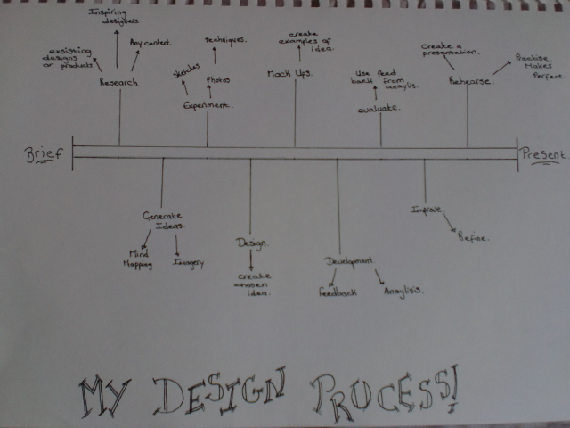
The Design Process
When it comes to the creation of a piece of work whether it be self iniated or commercial all practitioners will have a process that they will go through in order to create it. Although it may very from practitioner, the initial structure of the design process will be very similar if not exactly the same.
Here is an example of how the design process may be drawn out as a diagram. In the beginning there are lots of lines as your brain thinks of many ideas and does a lot of research, then the lines would become less as some of the ideas are experimented with and prototypes are created. Eventually the lines will become one singular line as the idea is refined into the final experiments and then the final creation.
Although this a very simple version of the design process I think that this will be the basic structure the all designers will use, including myself. For my brief on creating a magazine I also followed a design process, here is the design process I followed.

 |
| Image Taken From: http://www.helloari.com/wp-content/uploads/process-explained.jpg |
Although this a very simple version of the design process I think that this will be the basic structure the all designers will use, including myself. For my brief on creating a magazine I also followed a design process, here is the design process I followed.
Subscribe to:
Comments (Atom)